


Design Concept & Objective
The core objective of this project was to integrate the traditional strength and modern energy of Taekwondo into a single visual language. Moving away from the conventional tropes of martial arts studios—such as doboks or Taegeuk symbols—the client sought a sophisticated and distinctive identity akin to a global sports brand. To create a commanding presence that captures attention instantly, I applied a bold color palette of Deep Black and Vivid Red.
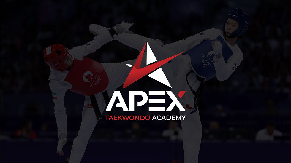
Visual Solution: The 'A' of Apex
The primary challenge was to reinterpret the letter "A" from the brand name "APEX" not merely as a character, but as a symbol embodying the brand's spirit.
- Dynamic Form: The main symbol fuses the trajectory of Taekwondo’s most powerful technique—the high kick—with the structural form of the letter "A." The sharp, upward-striking lines symbolize an unstoppable challenge toward goals and a sense of explosive speed.
- Symbolic Meaning: The acute angle at the top visualizes a mountain peak, representing the practitioner's spirit of striving toward the "Apex." This reflects the academy’s vision: a place where students hone their skills to reach their absolute prime.
- Typographic Harmony: To complement the dynamism of the symbol, I selected a bold, stable sans-serif typeface. By adding a red accent to the tip of the "X," I established a visual connection with the main symbol, giving the entire brand a cohesive rhythm.
Result
Going beyond a simple logo, this design achieves a perfect balance between the dynamic motion of Taekwondo and a solid brand identity. As a result, "APEX" has established a unique brand image that instills pride in its students while communicating reliability and powerful energy to the public.


